

Dragon’s Milk
Branding & Packaging Design Refresh
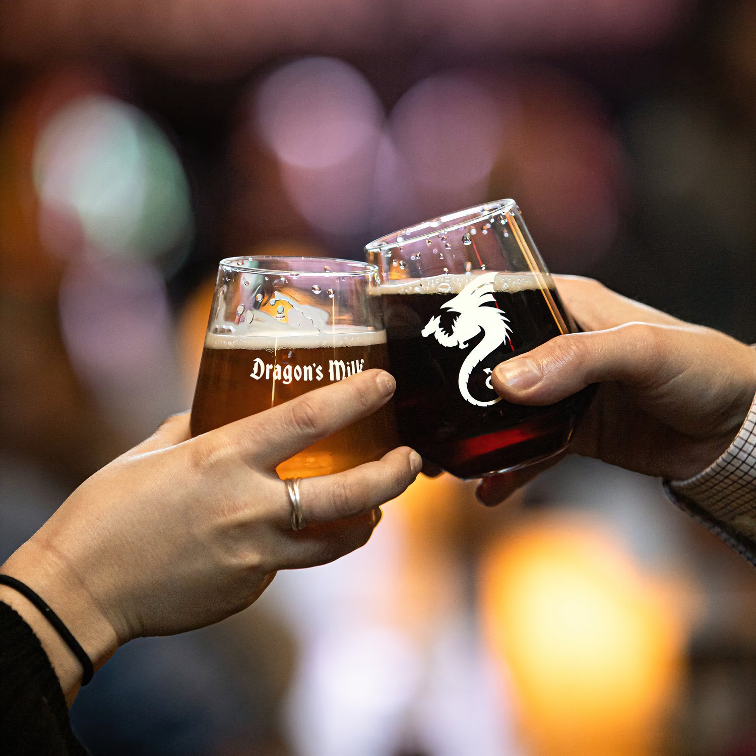
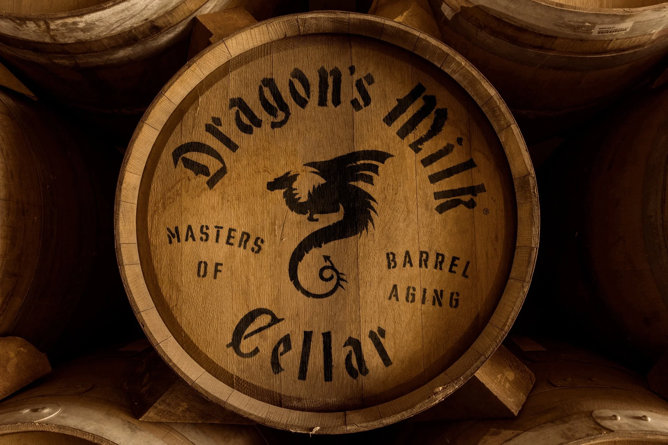
Throughout the ages, the term Dragon's Milk has been used to describe potent ales and elixirs worthy of celebration. A reward at the end of the journey.
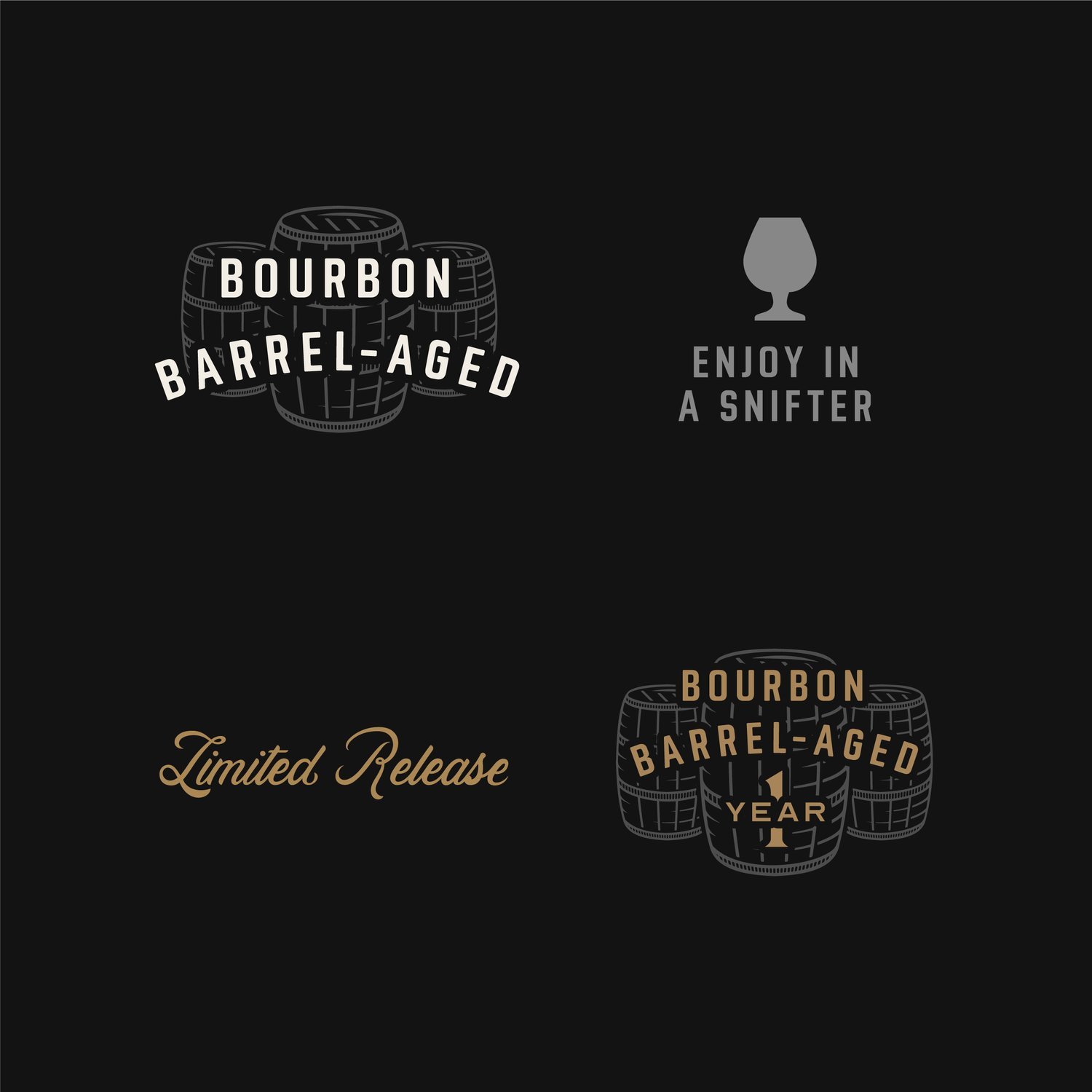
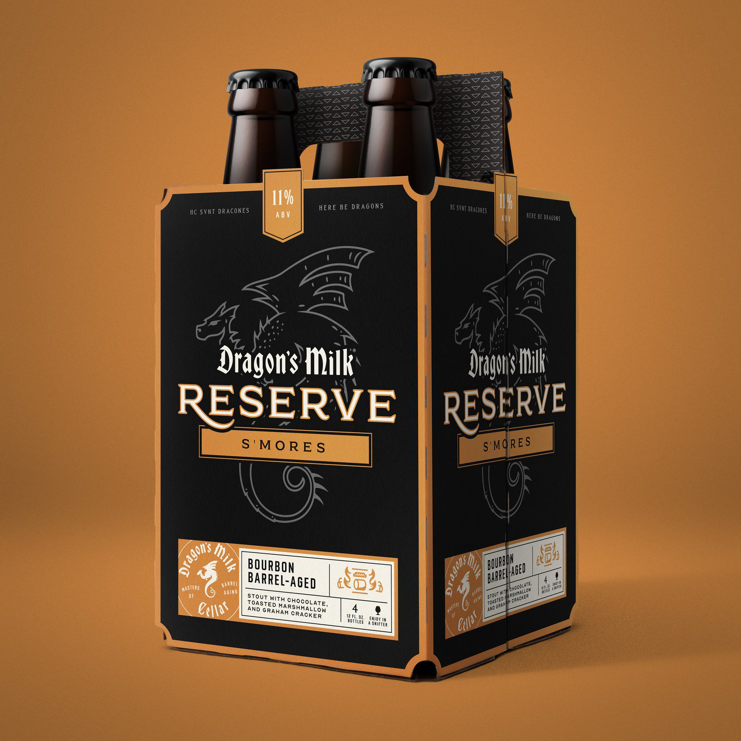
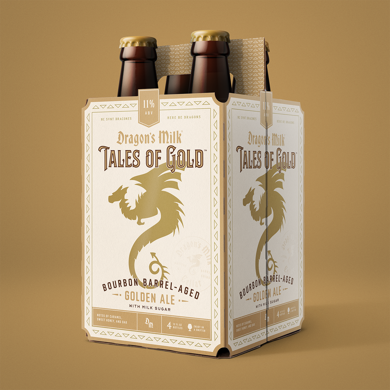
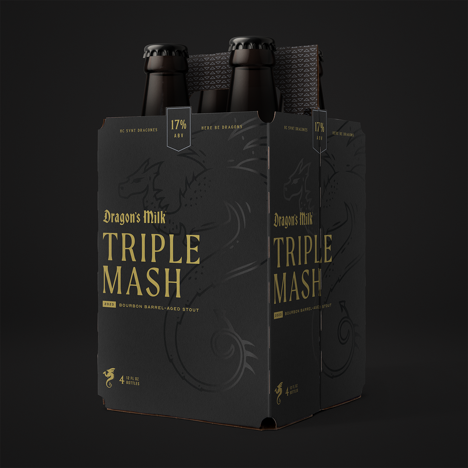
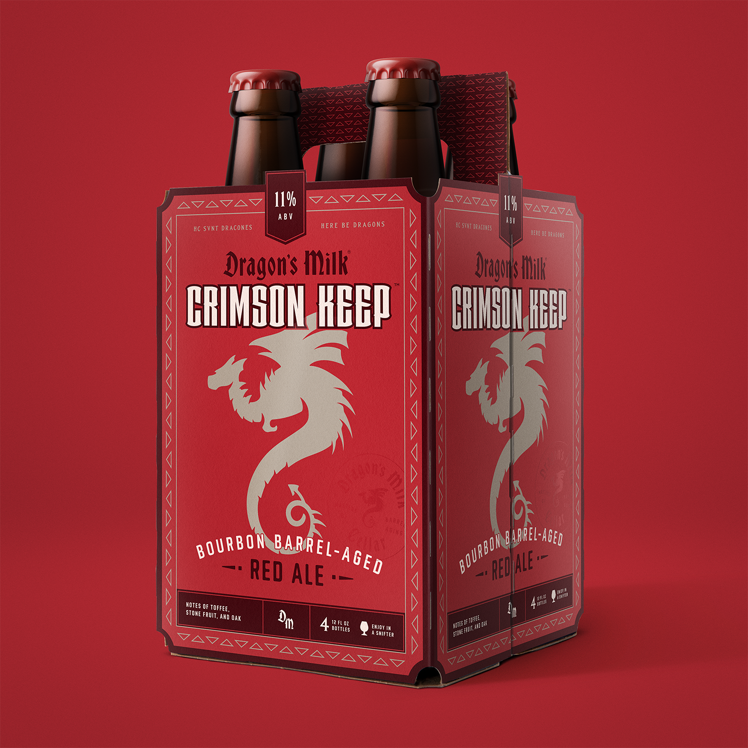
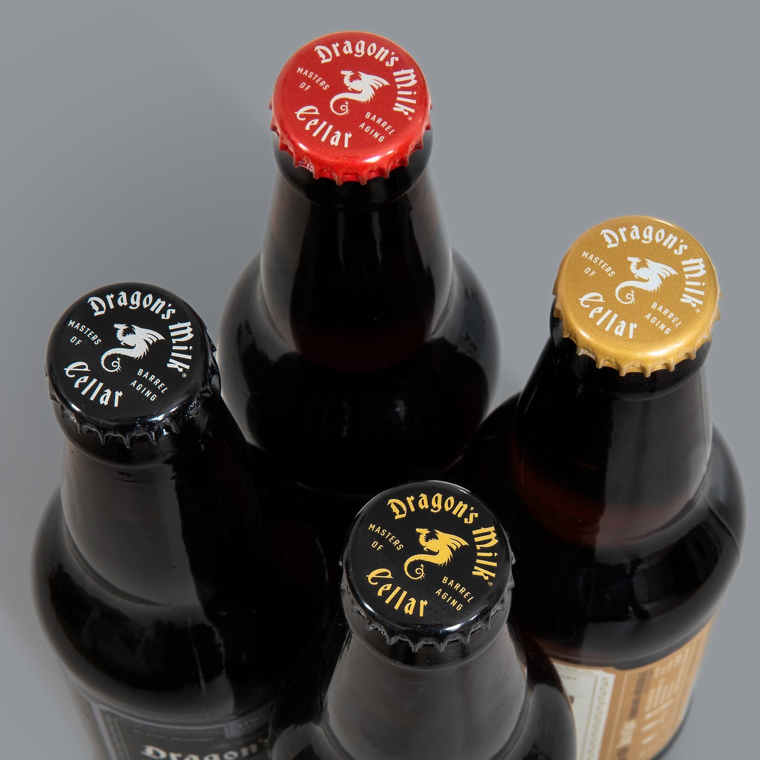
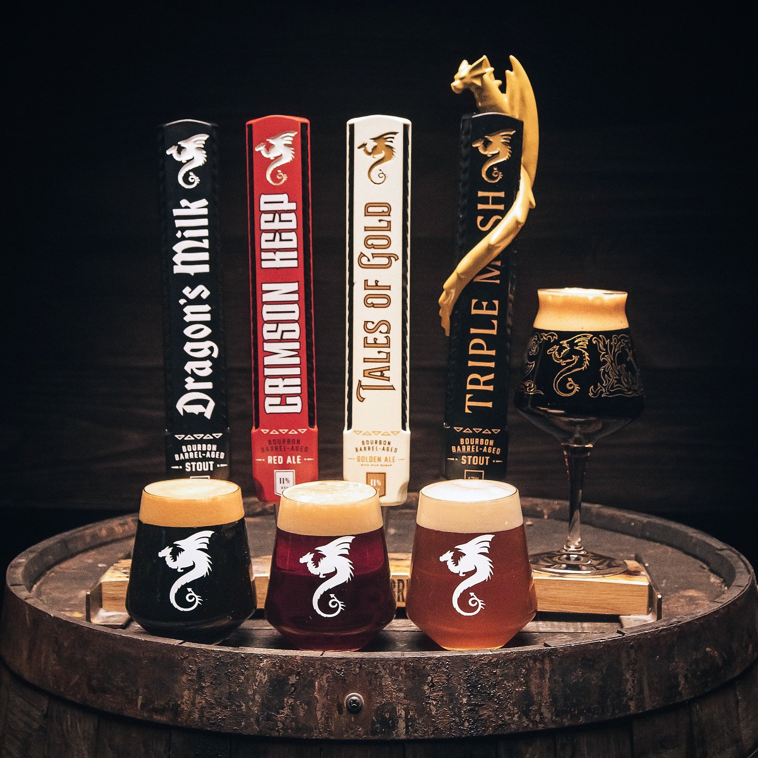
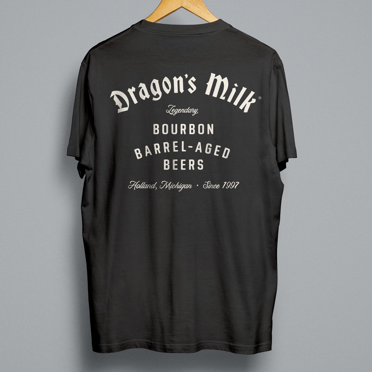
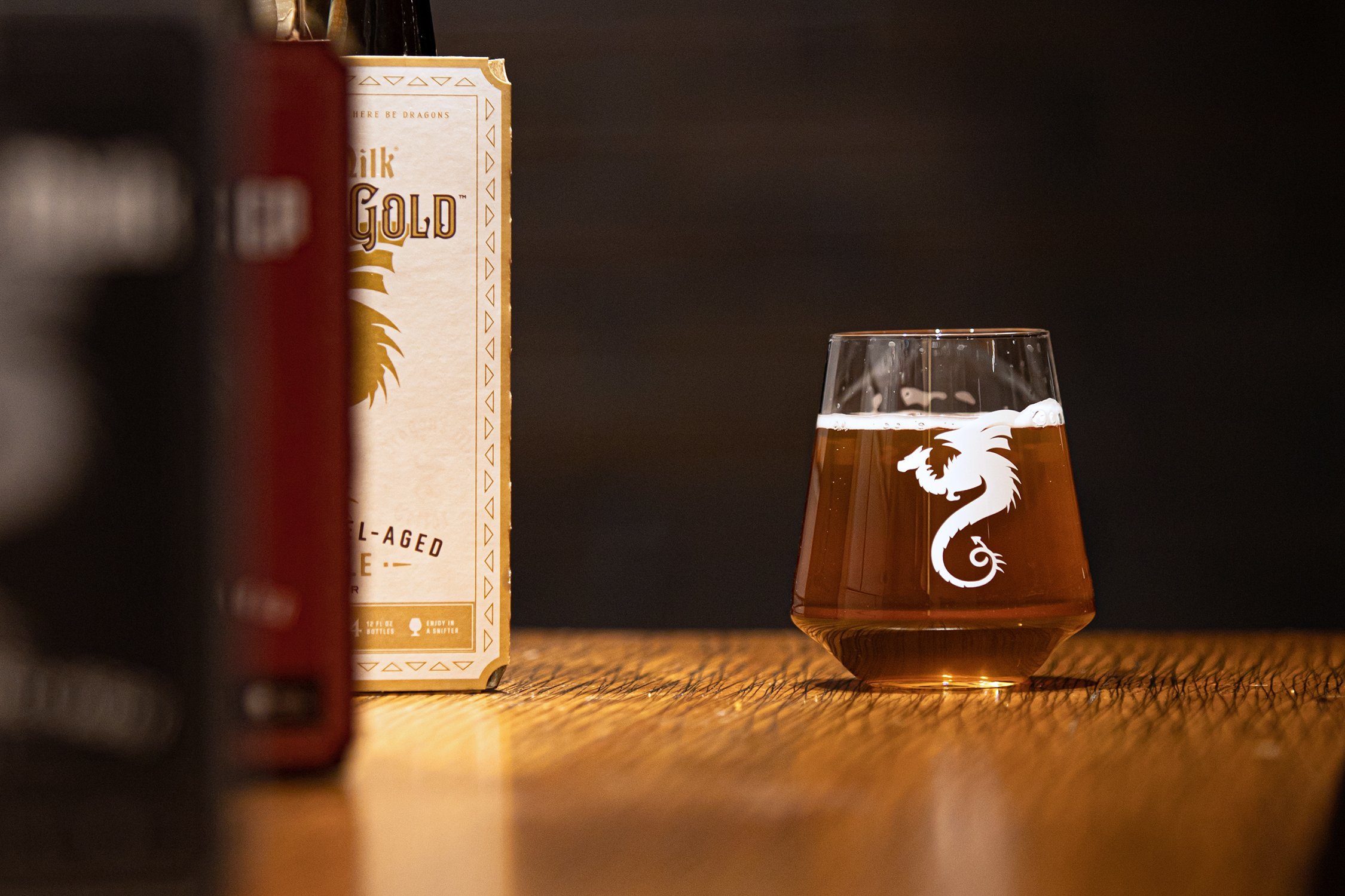
The #1 selling craft stout beer in America by Holland, Michigan’s own New Holland Brewing Company was looking to take their legendary bourbon barrel-aged beer family to the next level by refreshing the branding and packaging design with the introduction of two new beers–Red and Golden Ale. With a design focus of medieval-modern, we updated the dragon logo and wordmark, rethought the design of the 4-pack carriers by heightening to better protect its potent elixirs from harmful light exposure, maximize visibility and readability on the shelf and create a beautiful billboard of brands when placed side-by-side.
HERE BE DRAGONS.
Design Partner: Jimmy Morrissey | Photography: Austin Coyer


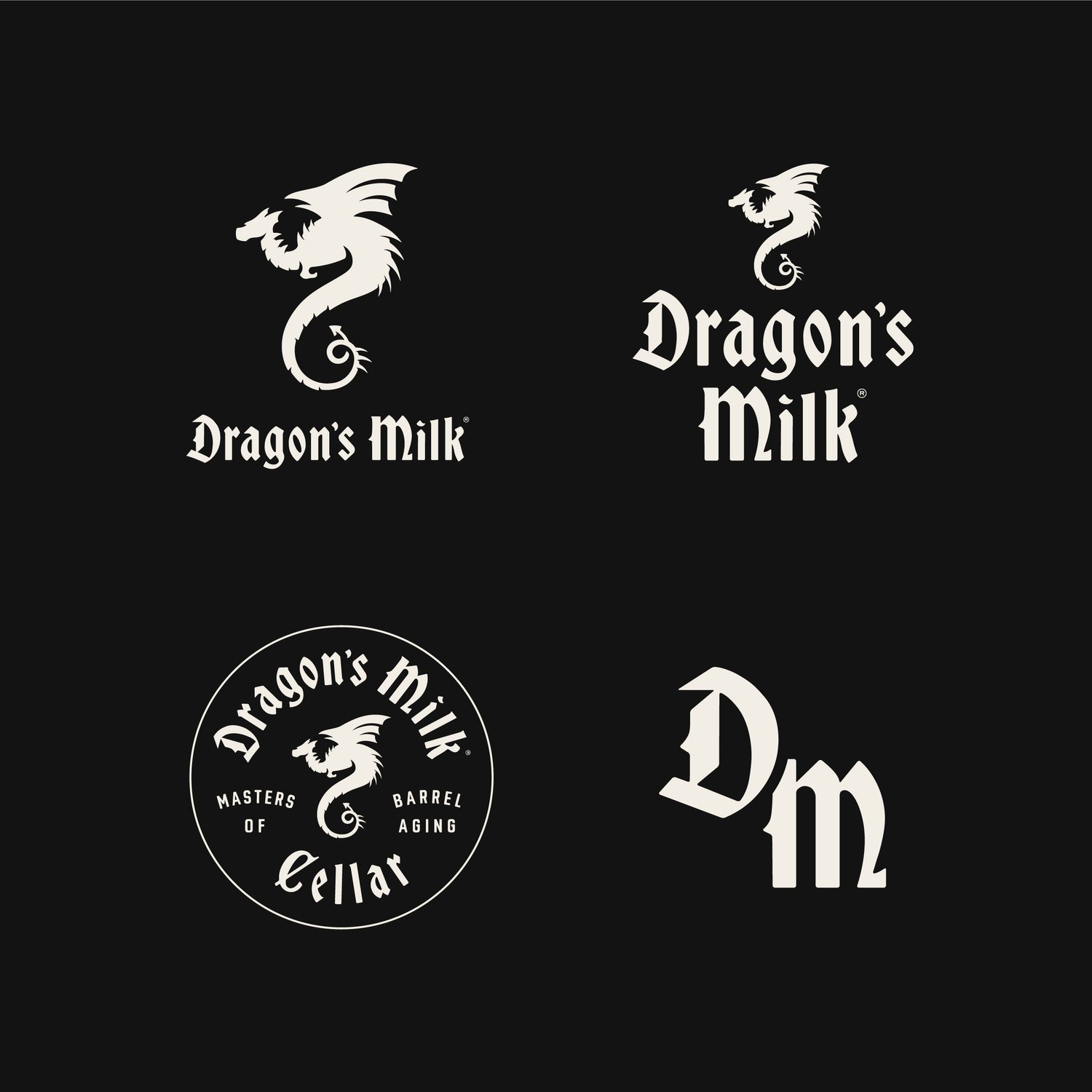
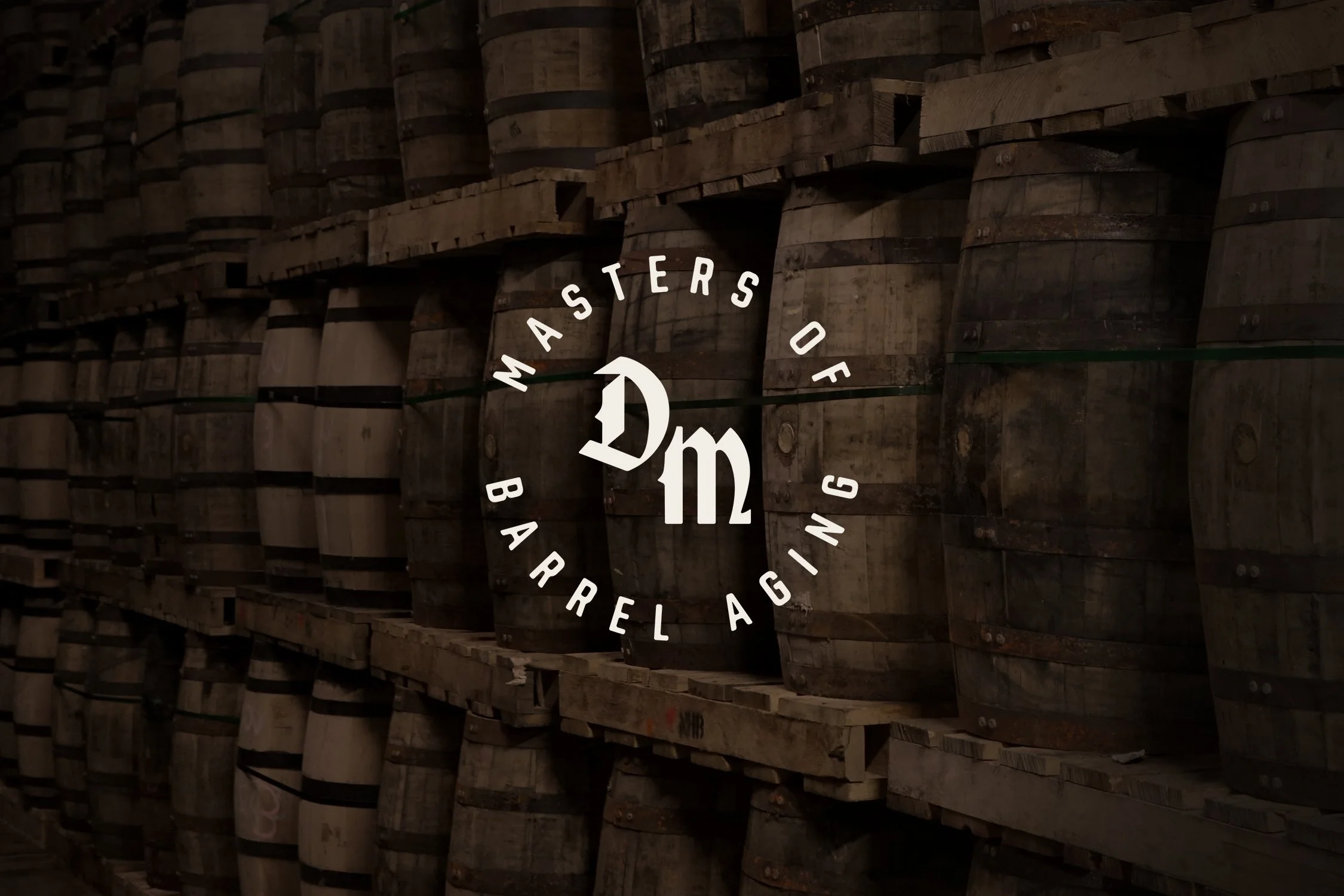
Re-Inventing
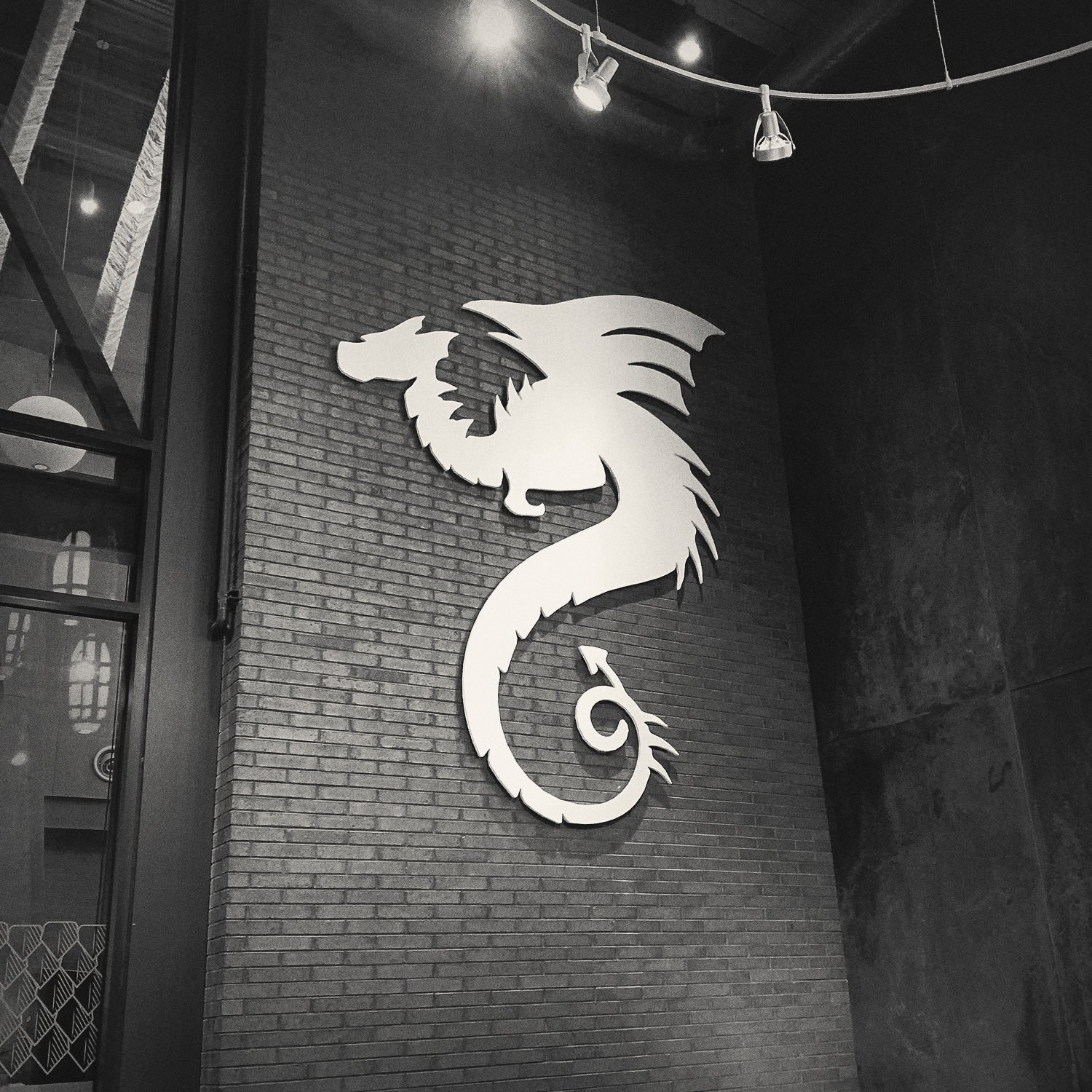
The Dragon
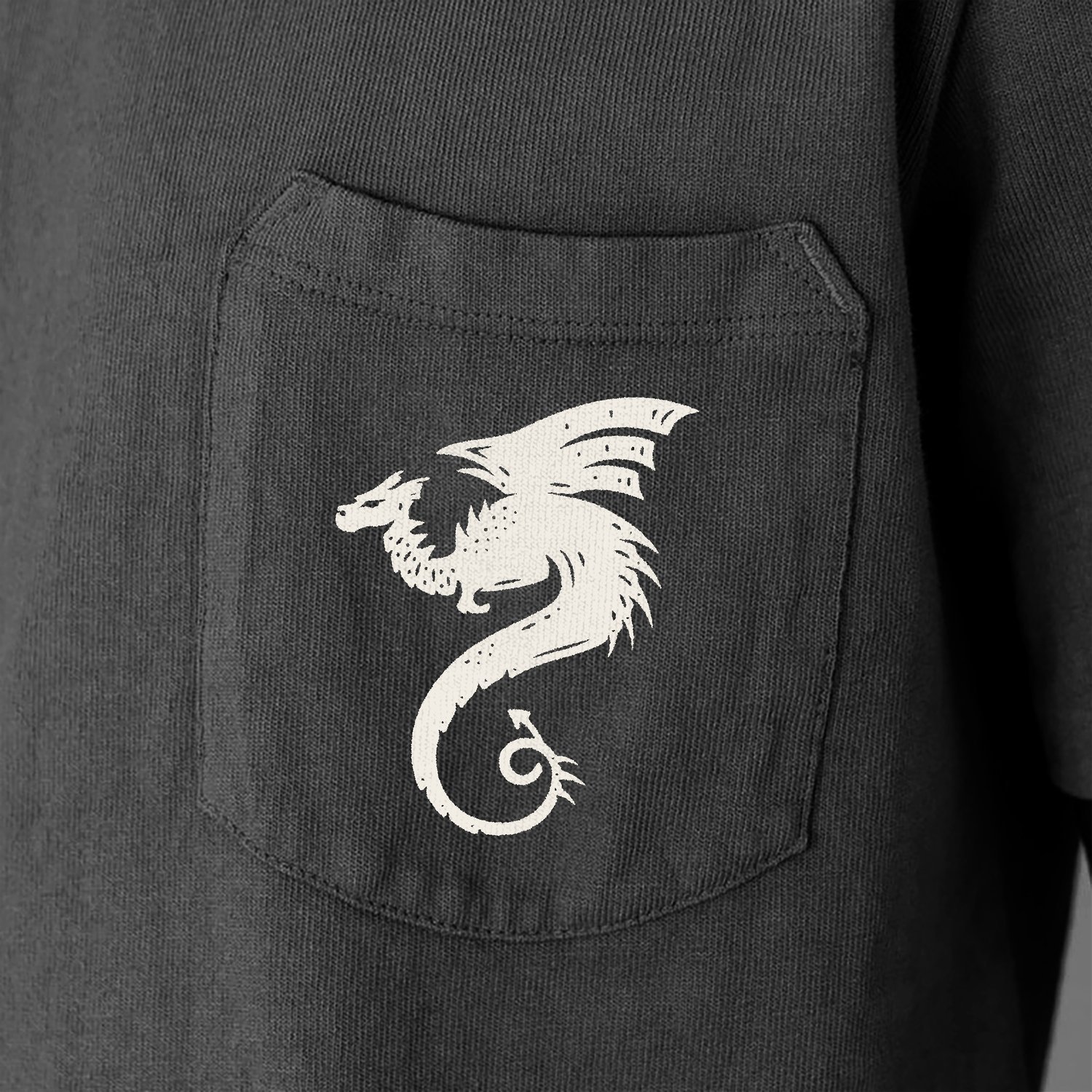
We worked with the New Holland team to give their iconic dragon logo a modernized update while keeping its recognizable shape intact. We cleaned up the fidelity of the edges and spikes, gave it more dimensionality, centered the body and tail, and had it stand taller and prouder. Scaleability was important so we wanted to make sure it also worked well at smaller sizes for print and digital.
Medieval Modern Wordmark
Having a custom wordmark that could become recognizable and ownable without the dragon icon was important, so we set out to explore typography that fit our medieval modern vision. Bold, timeless gothic blackletter became our focus and we pulled inspiration from Dragon’s Milk bourbon barrel-aged seltzer line — Dragon’s Share.